Page 1 of 2
Hard to read forum colours
Posted: 08 Nov 2013 19:19
by JonB
I find this forum very dark and hard to read. It's the red on black colour scheme. Very MTX-like, but not very legible. Any chance of brightening it up a bit? Anyone else got thoughts?
Re: Hard to read forum colours
Posted: 08 Nov 2013 22:26
by Dave
Jon,
might be best to continue with this thread :-
viewtopic.php?f=8&t=86
rather than starting a new one?
regards
Dave
Re: Hard to read forum colours
Posted: 09 Nov 2013 10:02
by JonB
Yes Dave, absolutely. If only I could read the search results..

Re: Hard to read forum colours
Posted: 09 Nov 2013 11:17
by Dave
Good point!
Is this any better ?
perhaps we should use this colour text?
ha ha ha !!
Re: Hard to read forum colours
Posted: 09 Nov 2013 16:02
by JonB
Good point!
Is this any better ?
perhaps we should use this colour text?
ha ha ha !!
Ha ha what a wag!
Re: Hard to read forum colours
Posted: 09 Nov 2013 16:12
by Dave
Well spotted !

Re: Hard to read forum colours
Posted: 11 Nov 2013 15:14
by thewiz
How about changing it to White text on Light Blue? I've attached a screenshot, I hope, of the colours I mean.
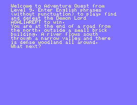
- memu-adventure.gif (1.92 KiB) Viewed 12466 times
Re: Hard to read forum colours
Posted: 11 Nov 2013 17:45
by Dave
mmm, it might just be because the text is slightly smaller in your screenshot,
but I actually find that harder to read
regards
Dave
Re: Hard to read forum colours
Posted: 11 Nov 2013 18:51
by 1024MAK
I have just noticed that one thing that is hard to read, is the "Author's" name, which is grey. This does need changing. I can't work out why I never noticed this before

I'm also not overly keen on the grey background to the edit boxes like the one I am currently writing this in. I think if grey is the colour, it should be a slightly darker shade of grey.
As to the white on blue. The picture is that of low resolution font. It may be easier to read in a better resolution. Maybe with a slightly darker blue.
Going back to the white text on black - I'm okay, indeed very happy with the readability.
The red text on black is also okay. Not as clear as the white, but still readable.
So now, because I can, here are some colours:-
The slow blue fox ran under the lorry with the MTX500's piled high...
The slow blue fox ran under the lorry with the MTX's piled high.......
The slow blue fox ran under the lorry with the MTX's piled high.......
The slow blue fox ran under the lorry with the MTX512's piled high...
The slow blue fox ran under the lorry with the MTX's piled very high...
The slow blue fox ran under the lorry with the RS128's piled high...
All these are okay for my eyes
 Mark
Mark
Re: Hard to read forum colours
Posted: 11 Nov 2013 19:26
by Dave
My observations on Mark's text . . . .
1024MAK wrote:I have just noticed that one thing that is hard to read, is the "Author's" name, which is grey. This does need changing. I can't work out why I never noticed this before
So now, because I can, here are some colours:-
The slow blue fox ran under the lorry with the MTX500's piled high... A bit dark
The slow blue fox ran under the lorry with the MTX's piled high....... Good
The slow blue fox ran under the lorry with the MTX's piled high....... Better than blue, but still lacking contrast
The slow blue fox ran under the lorry with the MTX512's piled high... Better than blue, but still lacking contrast
The slow blue fox ran under the lorry with the MTX's piled very high... Good
The slow blue fox ran under the lorry with the RS128's piled high... Good
Mark
ps - nice words, where are "c j k q z" though>